
I had no idea UK county flags were this awesome
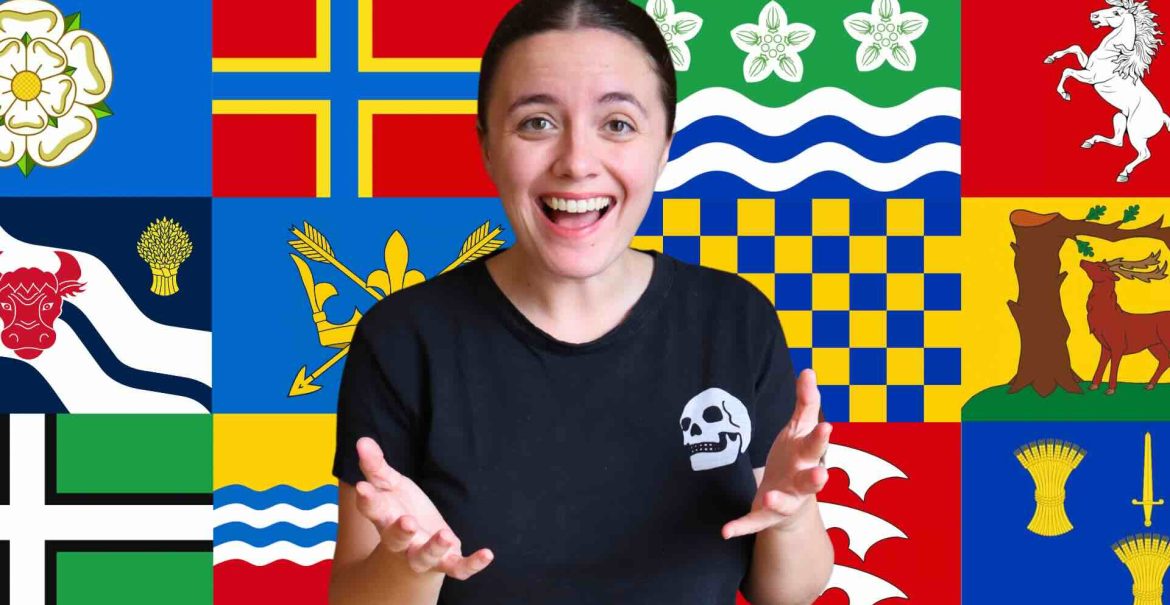
I have a crocheted flag and a little stained-glass flag in my background, both made by people in this community. I was excited to take a closer look at the UK county flags, although I had no idea there were so many. My understanding was that there were 50 to get through, and my partner had made a tier list so I could react without seeing too much in advance. There would be a winner. There would be bragging rights. There would also be quite a lot of me failing to pronounce place names.
I went in assuming that county flags would mostly be lines, blocks of colour and crosses. Some are. Some have a lot more going on. Once I started seeing animals, coats of arms and very specific local symbols, I became much more interested in why people had chosen them. I still ranked them mostly by gut reaction, though. A flag has to do something for you.
I like a flag with some fight in it
That was the standard I accidentally set almost immediately. The Anglesey lion looked sharp, pointy and aggressive, which I loved. Bedfordshire had bright colour and shells, and I did genuinely like it, but I also found myself imagining it going into battle with a couple of shells on it. God willing, no county has to do that. Still, I wanted the designs to have some character.
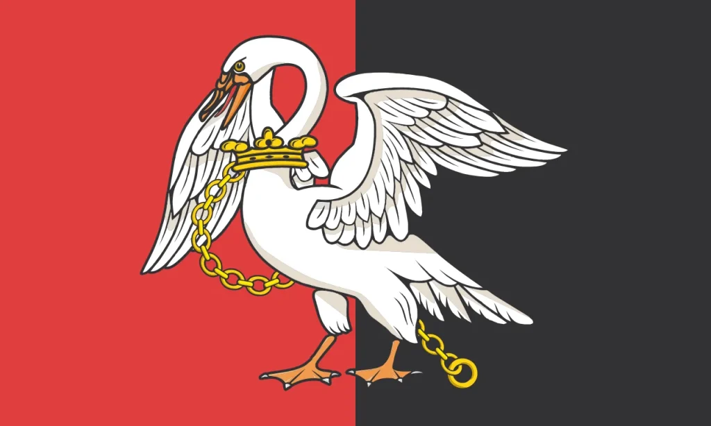
Berkshire was an early favourite because it had a stag and an oak rather than a set of plain stripes. Then Buckinghamshire appeared with a swan on red and black, wearing a chain, and that was it for me. It looked like the swan was coming for you. I loved the colour, the imagery and the slightly unhinged energy of it. At one point I suggested that whichever flag won should decide where I went on holiday, despite having no clue where most of the counties were.
History helped, but it couldn’t do all the work
I loved learning that many of the designs had a long history behind them. A story about a symbol, a local animal or an old coat of arms could make me warm to a flag I hadn’t expected to like. I didn’t know that a county flag could contain so much local detail.
But a historic explanation couldn’t rescue a design I found boring. I have a very clear bias against plain crosses. Cornwall’s black-and-white flag at least had a bold look, but it still became my first boring flag. By the time I got to Devon, Dorset, Orkney and Shetland, I had to accept that a cross was going to have a hard time with me. Dorset had a golden dragon in its background story, and I couldn’t stop wondering why the dragon hadn’t made it onto the flag. Put a golden dragon on something and I am immediately more interested.
The flags that made me stop talking about crosses
The designs I loved gave me an image to latch onto. Essex had three notched saxes on a red field and felt properly bold. Flintshire had birds and an elaborate cross that I described as a “super bougie cross.” Merioneth had three goats dancing against a rising sun. It was weird, it was memorable and I respected that Wales had really gone for it.
Kent had an advantage because I have lived all over Kent during my nearly 11 years in the UK, and I already loved its white horse. The horse didn’t seem centred to me, which has always annoyed me a little, but I couldn’t pretend that I didn’t love it. It is in motion. It does not sit there politely. The same applied to Warwickshire’s bear, Suffolk’s crown and arrows, and Oxfordshire’s ox, tree, wheat and river lines. They all gave me something to look at.
I also enjoyed the designs that were a bit odd. Rutland’s horseshoe and acorns were cute. Surrey’s blue-and-gold chequers hurt my eyes, but they were unforgettable. A flag can be strange, slightly ugly and still much more fun than another perfectly respectable cross.
Buckinghamshire kept its crown
By the end, my preferences were obvious. The designs I called boring were usually plain crosses. The best ones had large, iconic imagery that I could remember after the next flag had appeared. I liked that the counties had taken what might have been a dry bit of local identity and made it so specific.
Buckinghamshire still won. That angry-looking chained swan on red and black felt like the most memorable flag in the whole list, and I said it was the most badass flag of any county I had ever seen. Many Canadian provincial and territorial flags seem boring to me, and I had much the same reaction to American state flags. I loved how much memorable imagery there was in these county flags.





No Comments